Cantine Battifarano
The Battifarano farm winery has been owned by the same family for more than five centuries of land cultivation. The starting point of the identity was the archive of ancient books that belonged to their ancestors, some dating back almost to the invention of printing.
Rather than borrowing the usual imagery of wine, we brought part of this treasure of typography and engraving to the public, through the brand and the labels of the wines.

A story to be told
Five centuries of history form the heritage of Cantine Battifarano. Most wineries build their identity on vineyards, grapes and corkscrews; in Basilicata many local producers adopt heraldic crests or Greek finds to suggest a noble origin. This shared imagery flattens every brand and detaches it from its own story: a new winery could speak the same language as a historic one.
The challenge was to make a real legacy visible, beyond the familiar conventions of wine packaging.


Discovering the archive
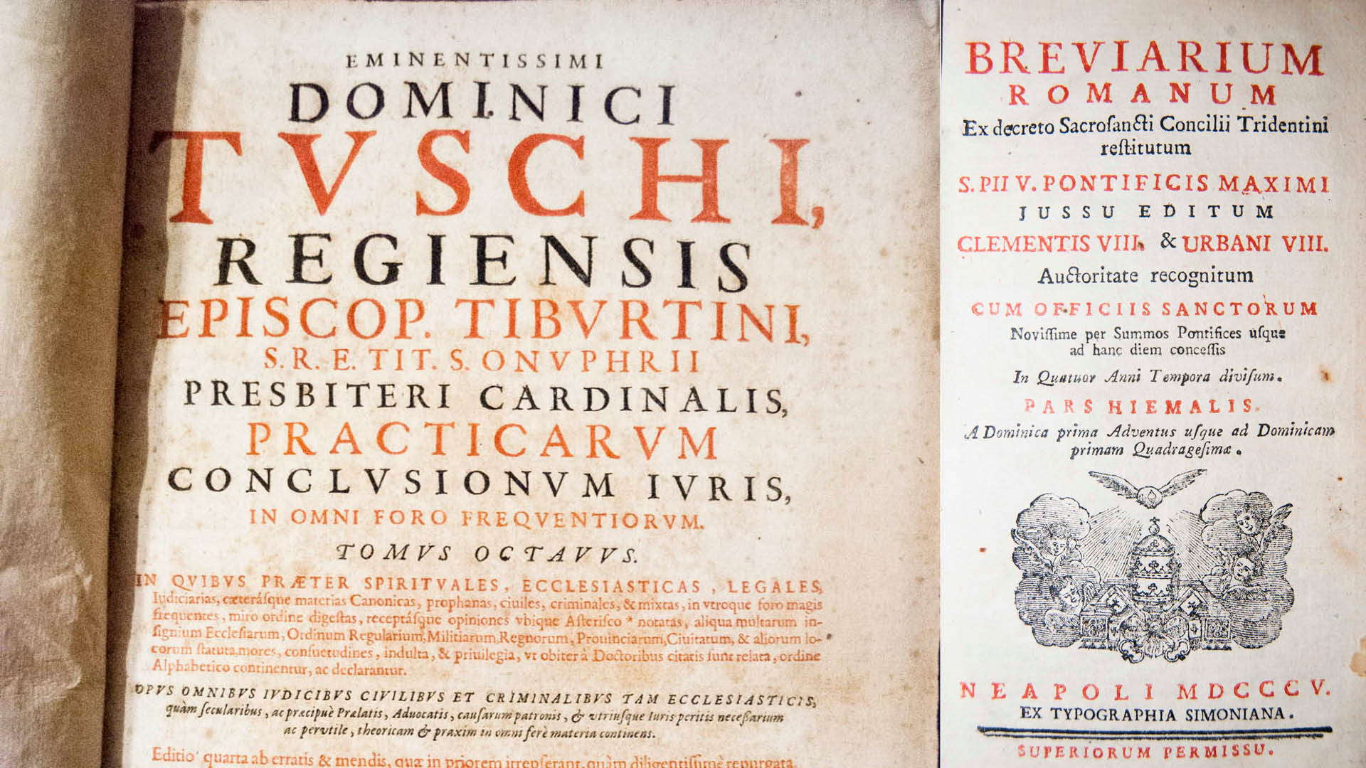
Exploring the family archive revealed manuscripts, account books, almanacs and printed volumes, some dating back to the eighteenth century and earlier. These volumes are the only visual link between the company and its origins. The discovery set the direction: turning original documents into the living material of the identity.


The concept
The central idea was to give the winery's history a new voice through its own archive. Rather than imitate the past, the project reinterprets it. The research focused on sixteenth-century title pages: large titles in Antiqua type, a hierarchy built through size and the alternation of red and black, and the printer's marks — the emblems of printers such as Aldus Manutius, which stood less for a trademark than for a creed (Festina lente, make haste slowly).
A stone coat of arms on the estate offered the family's own vocabulary: rampant lion, hand offering a sword, shield, star, plant motifs, initials and frame.


Designing the logo
Three directions were explored. Elegant distilled the coat of arms into a heraldic symbol. Vernacular richness drew on the chancery hand of the manuscripts and on the alchemical idea of turning lead into gold: humble materials paired with gold foil. Agriculture told the land through engraved landscapes.
The chosen mark comes straight from the title pages. The name is broken into four lines — BAT / TIF / ARA / NO — and set like a frontispiece title, in red, inside a frame. Small rhombi complete the letters and become the unit of measure for the construction and the clear space of the logo. A horizontal version with the payoff Vini · Cultura · Agricoltura covers back labels and capsules.


Research and reinterpretation
Headpieces, vignettes, initials and engravings were photographed one by one. Some originals had become difficult to read and were redrawn: the process preserved their historical character while adapting them for clarity, foil printing and reproduction at label scale. The drawing of the estate's tower, found among the family papers, became the illustration of the Torre Bollita wine.


Archive typography
The typographic language also originates from the letterforms of the family's books. Berlingske Serif carries titles and wine names with the contrast of old Antiqua; Minion Pro sets the payoff, Helvetica Light Condensed the technical data. Red Pantone 485 for the mark, a warm parchment tone (Pantone 7502) for the illustrations.


The packaging system
Every label takes its composition from a sixteenth-century title page: the mark at the top, the illustration at the centre, the wine name and vintage below. The archive leaves the shelves of the farmhouse, and whoever chooses a Battifarano wine takes a piece of it home.
DOC wines wrap the bottle in a 360° label carrying the story of the family, with illustrations printed in coloured foils — ruby for Akratos Rosso, magenta for Akratos Rosé, gold for Le Paglie, bronze for Torre Bollita. IGT wines share the same layout in offset, without foils. Black capsule, white logo. Each wine develops its own personality within one coherent family.


The result
The project makes a previously understated heritage visible. The archive becomes more than a place of preservation: it is the foundation of an identity connecting generations, culture and product. The range received a Silver at the IWSC 2018 and was featured on Packaging of the World.


